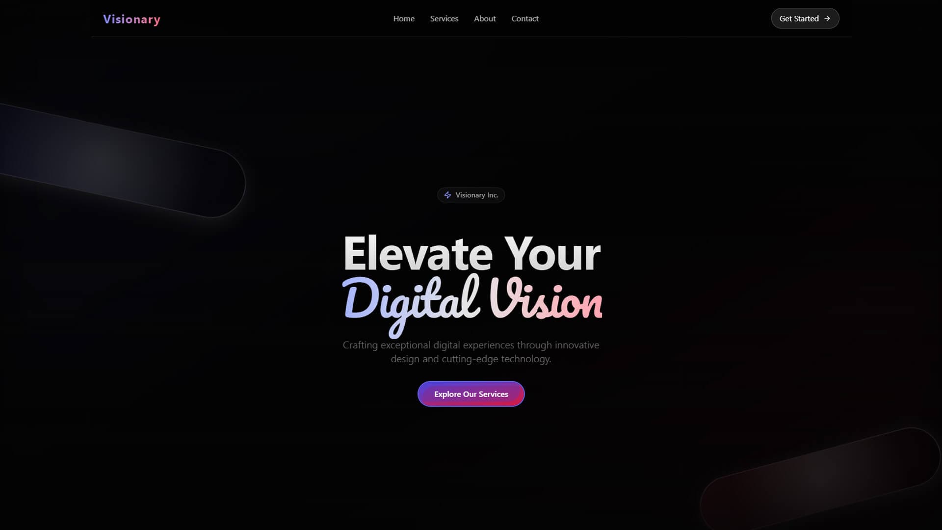

Most people now meet a brand as a tiny app icon, a circular profile picture, a dark-mode screen or a muted video in a feed, long before they see a business card. A logo that only looks good on a white page is no longer an identity; it is a starting point. Here is how I build brand identities that are designed for screens first and still hold together everywhere else.
What digital-first branding actually means
Digital-first does not mean "make it trendy". It means designing for the conditions people actually encounter the brand in:
- Tiny sizes. Favicons, notification icons and app icons at 16 to 48 pixels.
- Two colour modes. Many people browse in dark mode, and the brand has to work in both.
- Movement. Logos animate in videos, loaders and transitions.
- Crops you don't control. Social platforms crop profile images into circles and posts into squares or tall vertical frames.
- Sound off, then sound on. Video is often watched muted first.
- Interfaces. The brand has to live inside buttons, forms and dashboards, not just on the cover of a brochure.
The result is that a brand guide stops being a static PDF and becomes a system: a set of rules and reusable parts that designers and developers can apply consistently.
The six building blocks of a digital-first identity
1. A responsive logo suite
One logo is rarely enough. I typically design a family:
- a primary lockup for hero placements;
- a compact horizontal version for headers and navigation;
- a symbol or monogram that works on its own;
- an icon version simplified for very small sizes;
- one-colour versions for light and dark backgrounds.
Test every version at its real size. If the symbol turns into a blur at 32 pixels, simplify it rather than hoping nobody notices.
2. Colour as tokens, not swatches
Instead of "brand blue", define colour by role: background, surface, primary text, muted text, accent, success, warning and error. Give each role a value for light mode and for dark mode, and check text contrast against WCAG guidance, which asks for at least 4.5:1 for normal body text at level AA.
Tokens make the jump from design to code clean. The same names live in Figma variables and in the CSS or Tailwind theme, so nothing gets lost in hand-off.
On my own site I took this idea to an extreme: the colour theme is randomised on every visit. It still feels like one brand because only the hue relationships change. Each role keeps a fixed band of saturation and lightness, so the background is always deep, highlights are always vivid and contrast stays predictable. Randomise one variable, constrain the rest.
3. Typography that survives the screen
Choose typefaces for how they render at small sizes, not just how they look in a specimen. Variable fonts can deliver a full range of weights in a single file, which helps performance. If the brand speaks more than one language, test every script it needs. For brands in Pakistan, that often means pairing a Latin typeface with an Urdu one, and Nastaliq-style fonts are large files that need generous line height, so plan for both early rather than discovering them at launch.
4. Motion principles
Motion is part of identity now. Define:
- how the logo enters and exits, usually within one to three seconds;
- an easing personality, whether soft and calm, snappy and confident, or playful and springy;
- standard durations for interface transitions;
- what happens when someone has asked their device to reduce motion.
Deliver motion as usable files, such as After Effects templates for video and Lottie files for apps and websites, so the brand moves the same way everywhere it appears.
5. Sonic cues, when they make sense
A short sound logo for video, or a few interface sounds for an app, can make a brand more memorable. Keep them brief, quiet and consistent in tone, and never make sound the only way information is communicated.
6. Imagery and art direction rules
Now that generic imagery is effortless to produce, a consistent art direction is a real differentiator. Write down lighting, composition, colour grading, crop ratios and what to avoid. A recognisable photography or illustration style does more for a brand than a second logo variation ever will.
A touchpoint checklist
Before I call an identity finished, I mock it up on the places people will actually see it:
- the browser favicon and tab;
- iOS and Android app icons, including Android's themed monochrome icons;
- circular profile pictures on social platforms and WhatsApp;
- link preview images shared in chats and social posts;
- vertical story and reel formats, as well as square posts;
- the website header, footer, loading state and 404 page;
- email signatures and invoices;
- dark mode versions of all of the above.
If the identity falls apart on any of these, it is far better to find out before launch than after.
Flexible, not formless
Many next-generation identities flex: colours shift, patterns change, layouts adapt to the content. That only works if something stays fixed. My rule is to write two short lists before designing anything flexible:
- Never changes: logo geometry, primary typeface, tone of voice, core spacing rules.
- Can flex: colour combinations within the palette, graphic patterns, motion variations, campaign imagery.
On makashif.com, the palette, the fluid simulation and the background all change from visit to visit, but the Urdu calligraphy logo, the typography and the layout do not. That fixed core is what makes the variation read as personality rather than inconsistency.
My process, step by step
- Discovery. Audience, competitors, and an inventory of every place the brand will appear.
- Strategy on one page. Positioning, three personality words, and what the brand is not.
- Two or three concept routes. Genuinely different directions, not three shades of one idea.
- Stress test early. Each route goes onto real touchpoints, such as an app icon, a social post, a website hero and a dark-mode screen, before any polishing.
- Build the system. Logo suite, colour tokens, type scale, motion specs and templates.
- Hand over everything. Industry-standard source files and a guide written to be used, not admired.
Because I handle both brand identity design and motion graphics, the logo and its animation are designed together from day one, rather than the motion being bolted on afterwards by someone else.
Common mistakes to avoid
- Designing only the hero lockup. The small and one-colour versions are used far more often.
- Picking colours without checking contrast. A beautiful accent that fails as text colour will be misused.
- Shipping a PDF guide with no files. If the team cannot find the right logo file in ten seconds, they will screenshot one.
- Animating the logo as an afterthought. Motion reveals weak geometry quickly; design with it in mind.
Key takeaways
- Design for screens first: tiny sizes, dark mode, circular crops, motion and muted video.
- Build a logo family rather than a single logo, and test each version at its real size.
- Define colour as named roles with light and dark values, and share the same tokens across design and code.
- Treat motion and art direction as core parts of the identity, with clear, documented rules.
- Let some elements flex, but decide in writing what never changes.
Planning a project? Book a free discovery call — I'll tell you honestly what it needs.